Rexall is one of the oldest and most established pharmacy franchises in Canada.
Brief
Introduction of the recently purchased Well.ca into Rexall stores, spearheaded by TC Media. The brand must retain its own identity within the Rexall store while working in harmony with the Rexall brand.
Approach
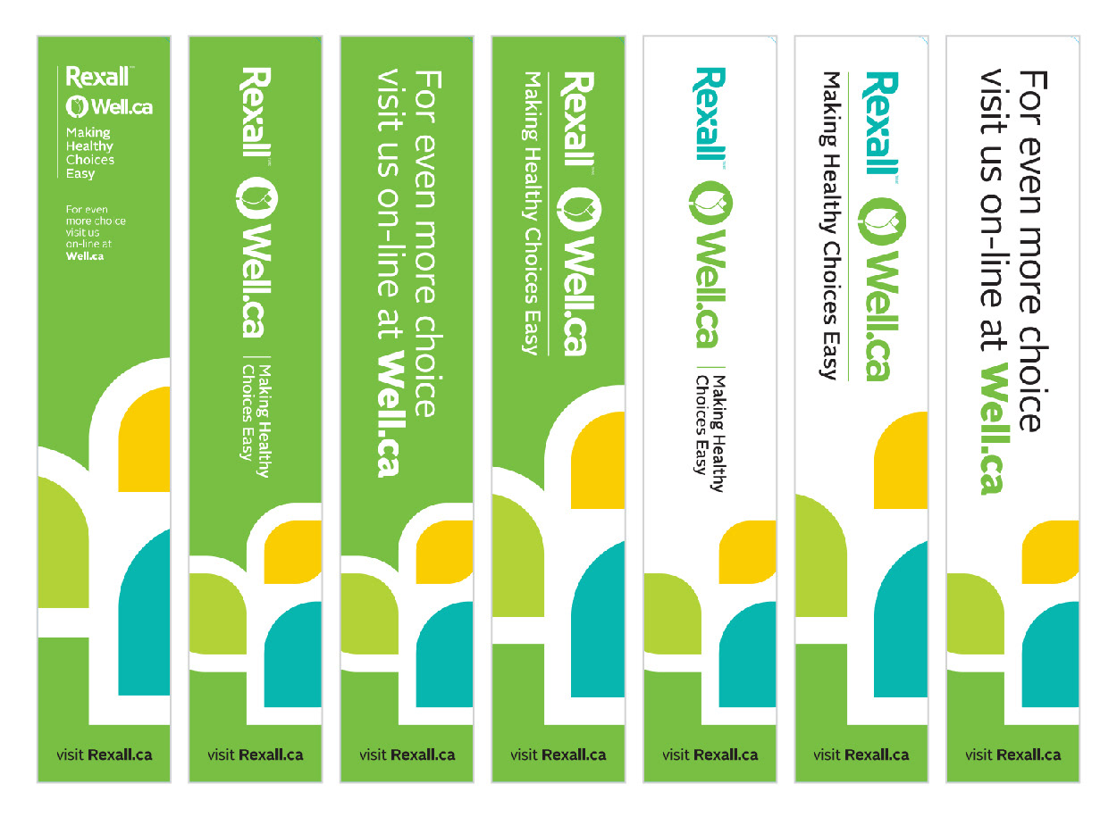
Examine the change of Rexall lime green to Well.ca green to facilitate a natural merging of the two brands.
Examine slight increase of Rexall yellow in-store and in conjunction with Well.ca.
The reexamining of the existing Rexall brand and fine tuning of a new Well.ca duo-leaf device and colour palette for the purpose of colour coded wayfinding; introduction of “Making Healthy Choices Easy” statement.
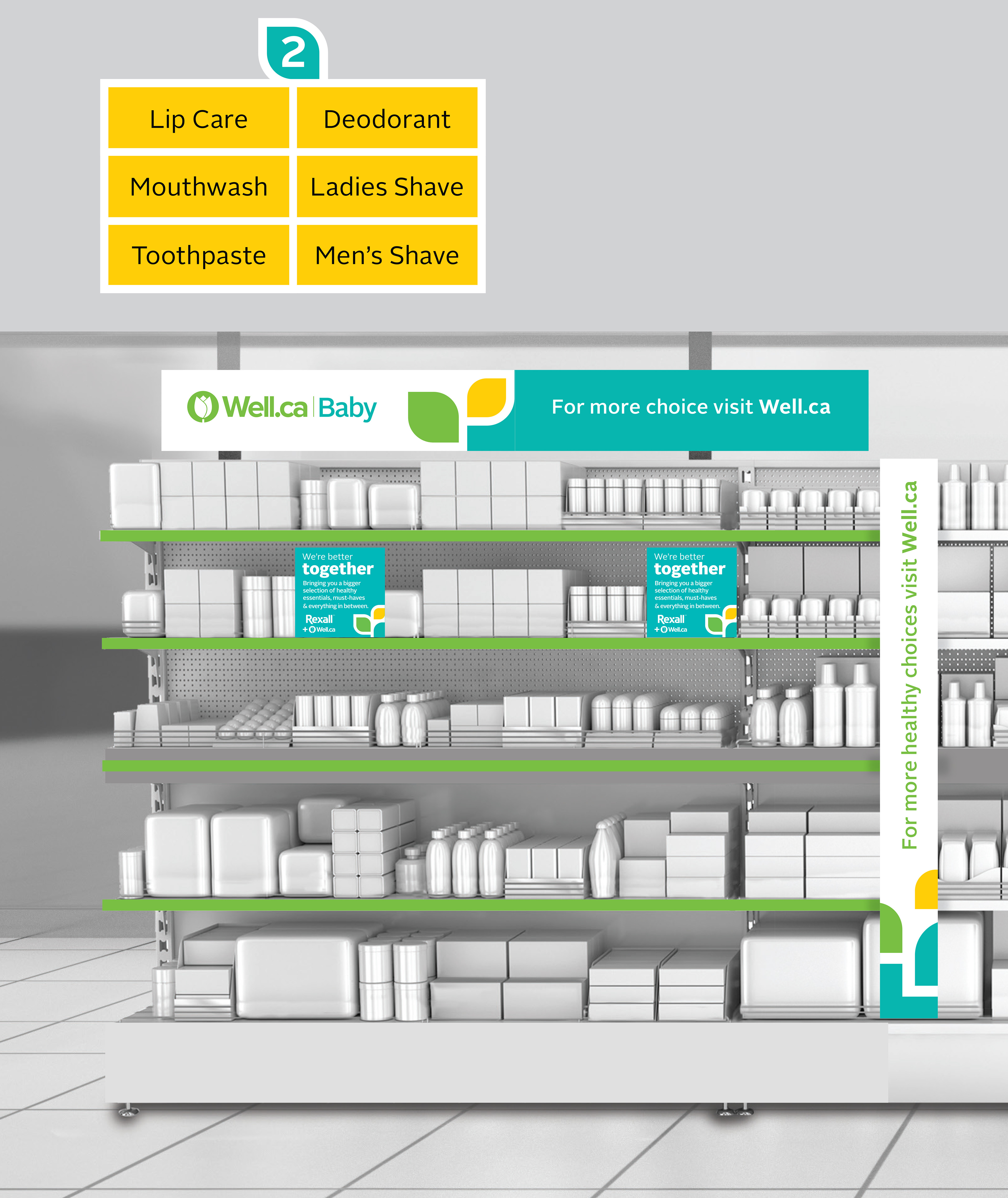
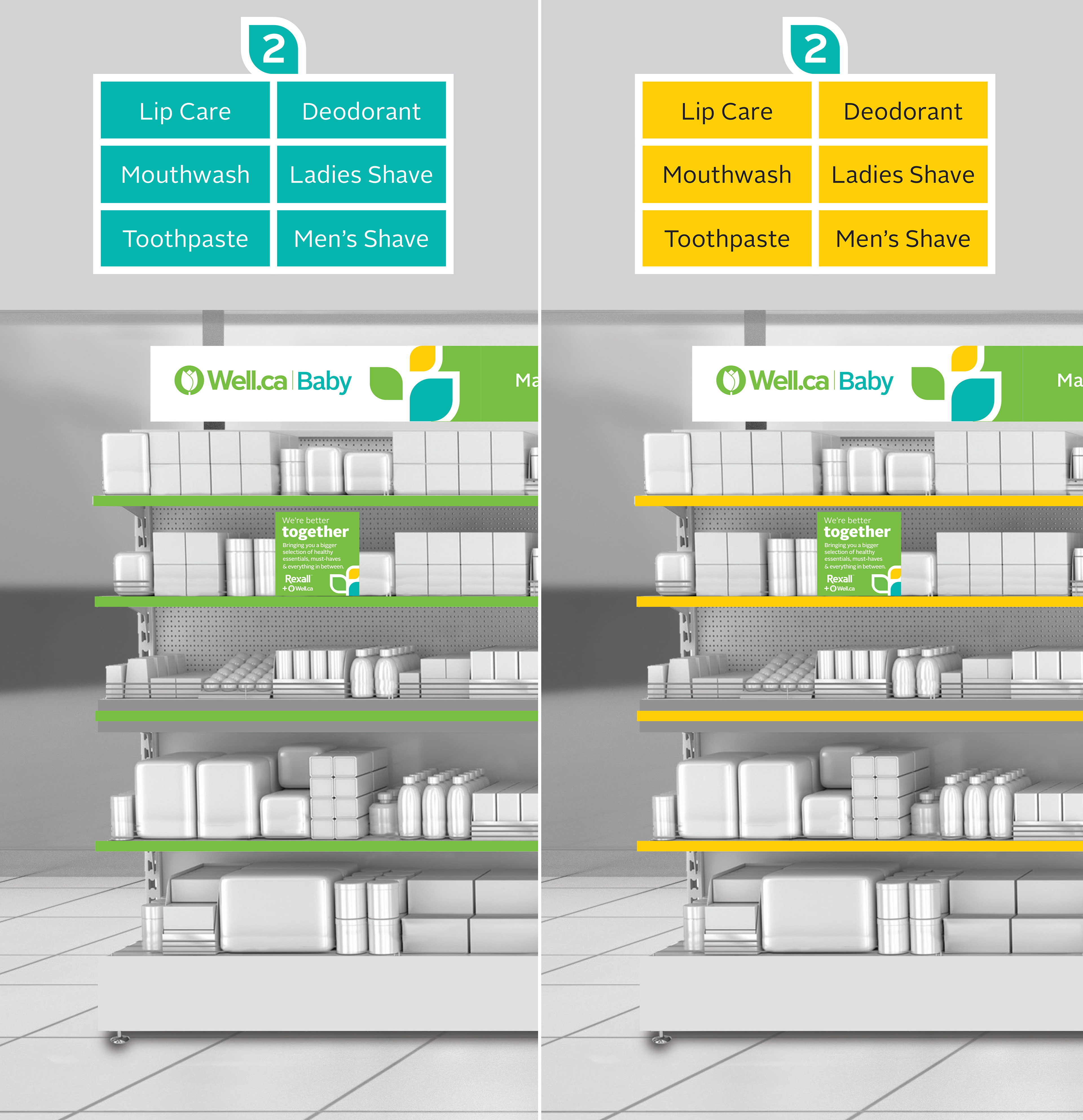
Specific areas of the store space are studied, including shelves (headers); lower level interiors (cash wall, pharmacy pick up and waiting areas); healthy drinks and snacks area.
Result
A number of the elements created in these exercises have been implemented across Rexall's stores, such as shelf header and blade designs.
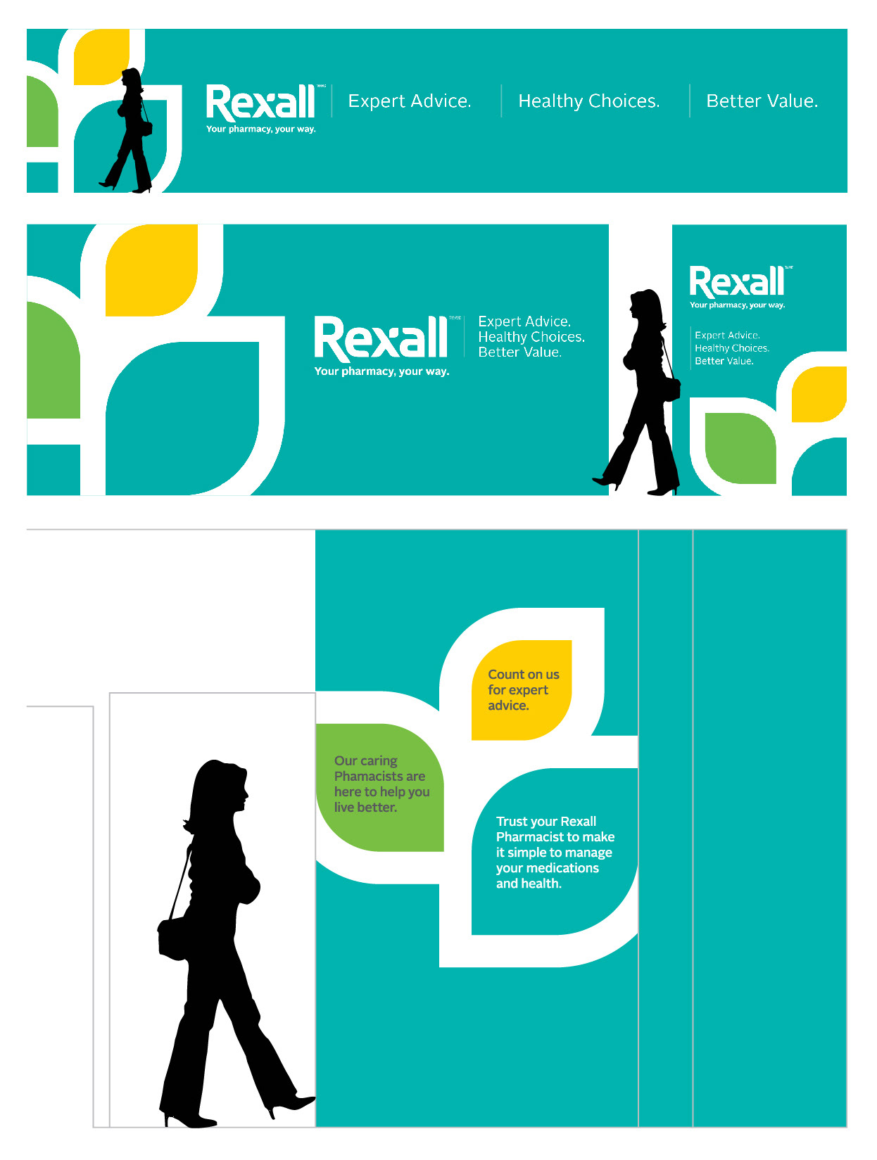
Brief
Introduction of the recently purchased Well.ca into Rexall stores, spearheaded by TC Media. The brand must retain its own identity within the Rexall store while working in harmony with the Rexall brand.
Approach
Examine the change of Rexall lime green to Well.ca green to facilitate a natural merging of the two brands.
Examine slight increase of Rexall yellow in-store and in conjunction with Well.ca.
The reexamining of the existing Rexall brand and fine tuning of a new Well.ca duo-leaf device and colour palette for the purpose of colour coded wayfinding; introduction of “Making Healthy Choices Easy” statement.
Specific areas of the store space are studied, including shelves (headers); lower level interiors (cash wall, pharmacy pick up and waiting areas); healthy drinks and snacks area.
Result
A number of the elements created in these exercises have been implemented across Rexall's stores, such as shelf header and blade designs.

Well.ca Duo-leaf Device
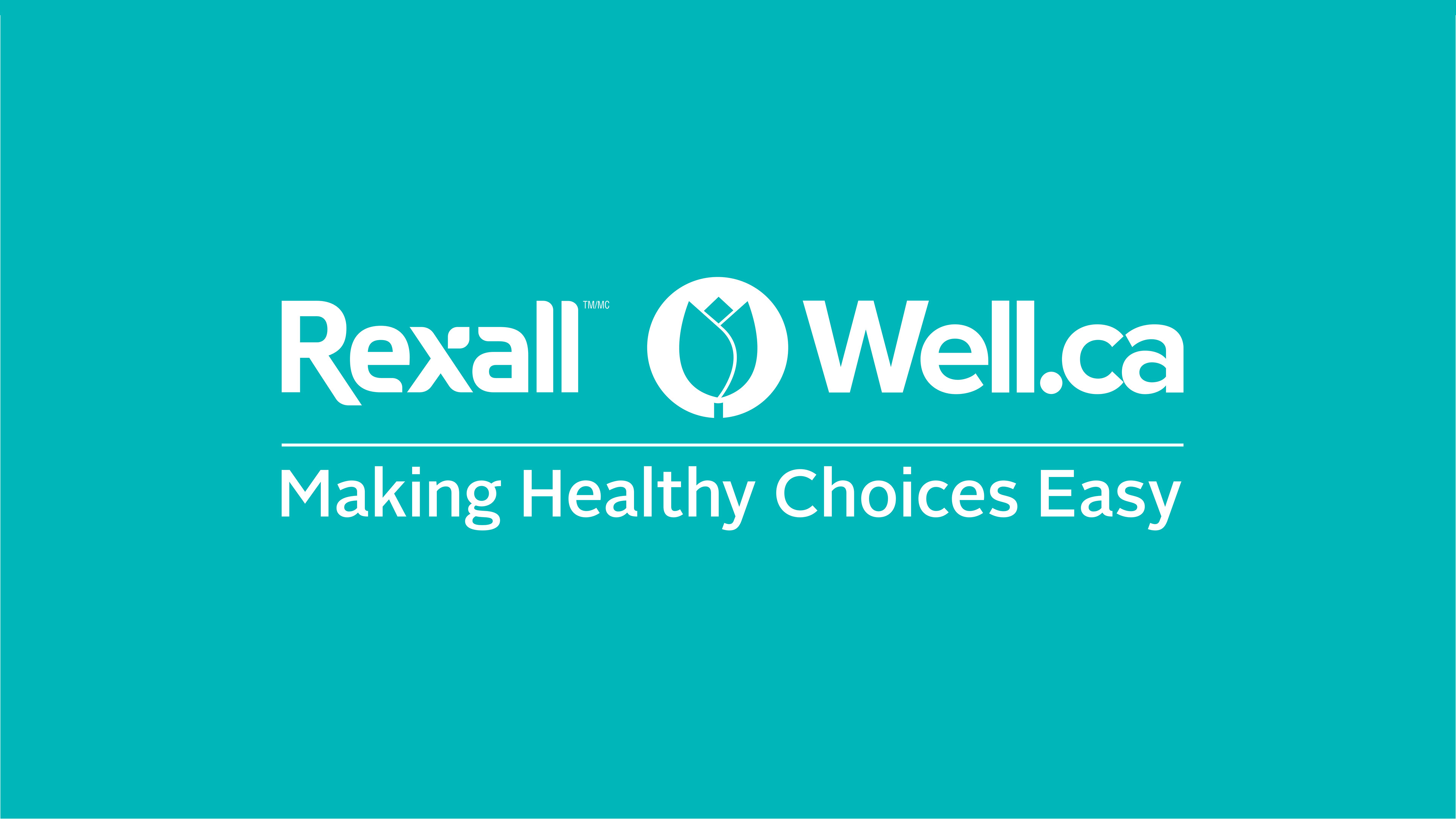
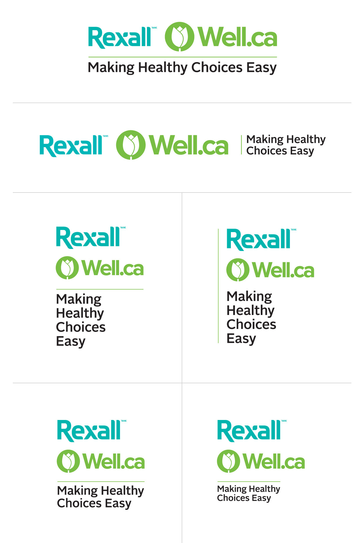
Rexall / Well.ca Logo
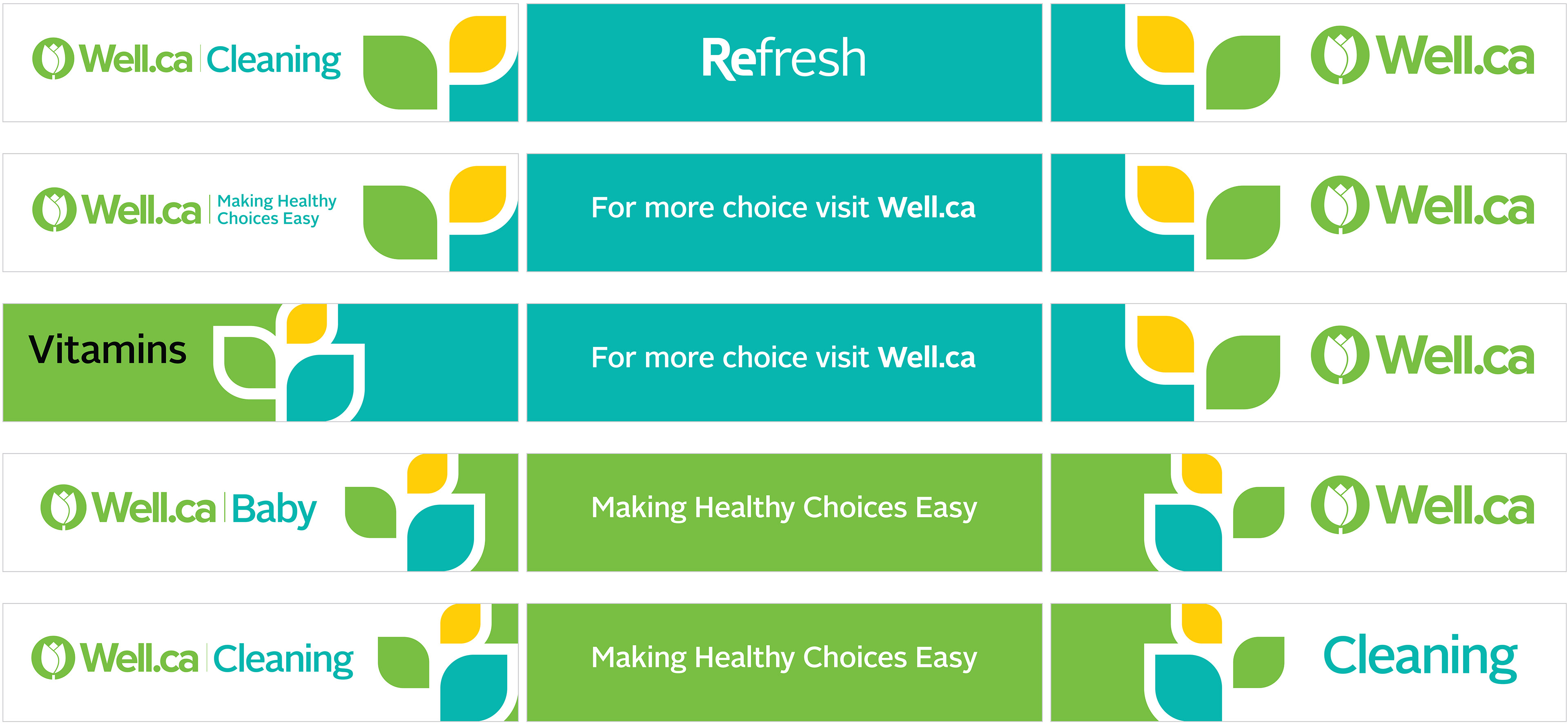
Well.ca Cleaning Shelf Header
Well.ca Vitamins Shelf Blade
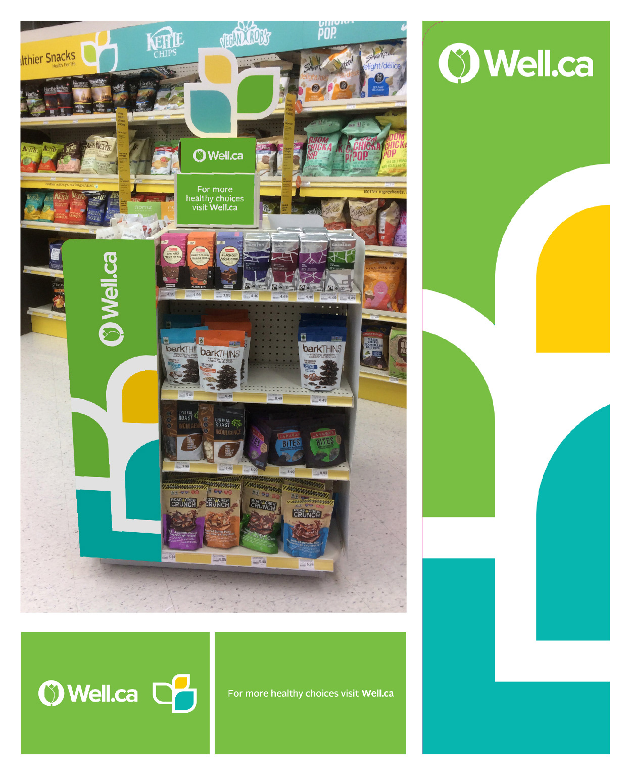
Well.ca Healthy Snacks 4-Way Blade & Topper
Cash Wall, Pharmacy Pick-Up & Waitng Area